
To view real-time performance data, make sure that your app uses a Performance Monitoring SDK version that's compatible with real-time data processing. Learn more about real-time performance data.
Track key metrics in your dashboard
To learn how your key metrics are trending, add them to your metrics board at the top of the Performance dashboard. You can quickly identify regressions by seeing week-over-week changes or verify that recent changes in your code are improving performance.
Here are some example trends that you could track:
- An improvement in first input delay as you've changed when your app loads certain JavaScript files
- A decrease in the time for first contentful paint after switching to use a CDN for assets
- A drop in response payload size for a network request since you implemented the use of thumbnails
- An increase in network response time for a third-party API call during an ecosystem outage
Each member of a Firebase project can configure their own metrics board. You can track metrics that are important to you, while other project members can track completely different sets of key metrics on their own boards.
To add a metric to your metrics board, follow these steps:
- Go to the Performance dashboardin the Firebase console.
- Click an empty metric card, then select an existing metric to add to your board.
- Click on a populated metric card for more options, for example to replace or remove a metric.
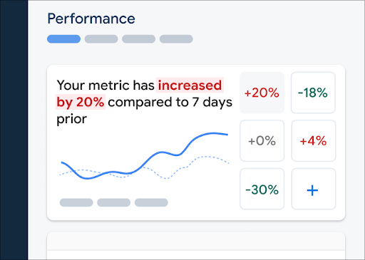
The metrics board shows collected metric data over time, both in graphical form and as a numerical percentage change.
- Each metric card displays the percentage change in the metric's value over the selected time range, as well as the metric's most recently collected value. The statement at the top of the metrics board is an interpretation of the percentage change.
- By default, the metrics board displays the metric's 75th percentile value, which aligns with Core Web Vitals. If you'd like to view how different segments of your users experience your app, select a different percentile from the dropdown at the top of the dashboard page.
What do the red, green, and grey colors mean?
Most metrics have a desired trending direction, so the metrics board uses color to display an interpretion of whether the metric's data is trending in a good or bad direction.
For example, say you're tracking a page's first input delay (a value that should be small). If this value is increasing, then the metrics board displays the metric's percentage change in red, calling attention to a possible issue. However, if the value is decreasing or unchanged, then the metrics board displays the percentage in green or grey, respectively.
If a metric doesn't have an obvious desired trending direction, like the response payload size for a network request, then the metrics board always displays the metric's percentage change in grey, regardless of how the data is trending.
What do the solid and dashed lines mean?
-
dark blue solid line — the metric's value over time
-
light blue dashed line — the metric's value at a specific time in the past
For example, if you select to show a chart of the last 7 days, and you hover over August 30, then the light blue dashed line tells you the metric's value on August 23.
View traces and their data
You can view all traces for your app in the traces table, which is at the bottom of the Performance dashboard. The table groups each type of trace within an appropriate subtab. For example, all network request traces are listed under the Network requests subtab.
The traces table displays the values for some top metrics for each trace, along with the percentage change for each metric's value. These values are calculated based on the selections of percentile and time range set at the top of the Dashboard tab. Here are some examples:
- If you select a percentile of 75% and a time range of Last 7 days, then the metric's value will be the 75th percentile of collected data from the most recent day, and the percentage change will be the change since 7 days prior.
- If you then change the time range to Last 24 hours, then the metric's value will be the median of collected data from the most recent hour, and the percentage change will be the change since 24 hours prior.
You can sort the list of traces in each subtab by the metric's value or by the percentage change for a specific metric. This can help you quickly identify potential problems in your app.
To view all the metrics and data for a specific trace, click the trace name in the traces table. The following sections of this page provide more details.
View more data for a specific trace
Performance Monitoring provides a troubleshooting page in the Firebase console that highlights metric changes, making it easy to quickly address and minimize the impact of performance issues on your apps and users. You can use the troubleshooting page when you learn about potential performance issues, for example, in the following scenarios:
- You select relevant metrics on the dashboard and you notice a big delta.
- In the traces table you sort to display the largest deltas at the top, and you see a significant percentage change.
- You receive an email alert notifying you of a performance issue.
You can access the troubleshooting page in the following ways:
- On the metric dashboard, click the View metric details button.
- On any metric card, select
=> View details . The troubleshooting page displays information about the metric you selected. - In the traces table, click a trace name or any metric value in the row associated with that trace.
- In an email alert, click Investigate now.
When you click a trace name in the traces table, you can then drill down into metrics of
interest. Click the
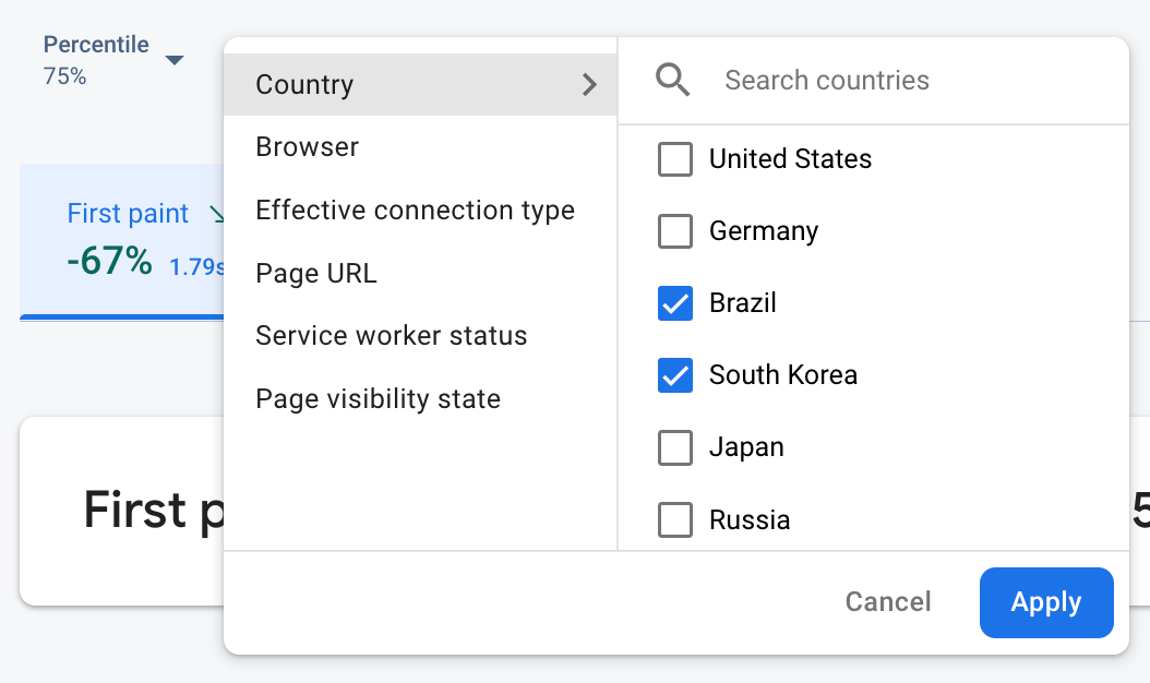
- Filter by Page URL to view data for a specific page of your site
- Filter by Effective connection type to learn how a 3g connection impacts your app
- Filter by Country to make sure your database location isn't affecting a specific region
View all collected metrics for a trace
Once you click into a trace, you can drill down into metrics of interest:
- Network request traces — The available metric tabs are response time and response payload size.
- Custom code traces — The Duration metric tab is always available (the default metric for this type of trace). If you added any custom metrics to a custom code trace, those metric tab are also shown.
- Page load traces — The available metric tabs include first paint, first contentful paint, first input delay, and DOM-related events.
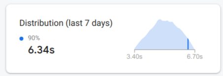
You can find a performance summary for the selected metric right below the metric tabs. This includes a one-sentence overview of the metric's trend over time, and a chart to visualize the distribution of the data across the entire selected date range.
View in-depth information about the data
You can filter and segment the data by attribute, or you can click to view the data in the context of an app-usage session.
For example, to understand why your recent network response time is slow, and whether a country is affecting performance, follow these steps:
- Select Country from the attributes dropdown.
- In the table, sort by the latest value to see the countries that have the biggest impact on your network response times.
- Select the countries with the largest latest values to plot them on the graph. Then hover your cursor over the timeline in the graph to learn when network response times slowed in those countries.
- To further investigate root causes of network response time issues in specific countries, add filters for those countries and continue investigating across other attributes (like radio types and devices).